5.1 Graphical Methods
Graphs are powerful data evaluation tools. They provide quick, visual summaries of essential data characteristics. A few simple plots can replace complex statistical equations or tests to interpret environmental data. Box plots, histograms, and normal probability plots are examples of graphs that are commonly used to display environmental data. These graphs can provide information about concentration ranges, shapes of distributions, extreme values (outliers), relationships between different data sets, and trends (increasing, decreasing, and cyclic). Because graphical methods are qualitative, however, they may not be appropriate as a stand-alone technique to make inferences or support conclusions.
Graphical methods are typically used with quantitative statistical evaluations. Graphical methods provide information that may not be otherwise apparent from quantitative statistical evaluations, so it is a good practice to evaluate data using these methods prior to performing statistical evaluations. Graphical methods are also a key component of exploratory data analysis (EDA). In EDA, various graphical techniques are used initially to display data for qualitative assessments prior to selecting appropriate statistical tests. Brief descriptions of some useful statistical plots are presented in the subsections below.
5.1.1 Time Series Methods
Time series methods graph data of interest, such as concentration, on the y-axis versus time on the x-axis. When plotting multiple series, it may be helpful to standardize or normalize data prior to plotting. Time series plots include lag-plots, correlogramsA plot of the autocorrelation coefficients versus the time lags. This plot is also known as an autocorrelation plot., and variograms.
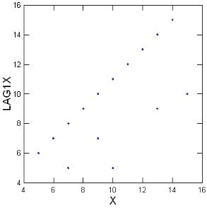
Lag-plots. Lag plots display observations for a time series against a later set of observations, or against the difference between the two (for example, a plot of x(t) versus x(t-1). If the lag plotA plot that displays observations for a time series against a later set of observations, or against the difference between the two sets. exhibits a linear pattern, it follows that data are nonrandom and that you may need to use an autoregressive model. If no patterns are discernible in the lag plot, data are likely random. Plotting data for a greater number of observational periods or lags can be helpful in evaluating data for seasonality. An example of a lag plot is provided in Figure 5-1.
Correlograms. Correlograms are commonly used to evaluate the randomness in a data set. Correlograms (or, autocorrelationCorrelation of values of a single variable data set over successive time intervals (Unified Guidance). The degree of statistical correlation either (1) between observations when considered as a series collected over time from a fixed sampling point (temporal autocorrelation) or (2) within a collection of sampling points when considered as a function of distance between distinct locations (spatial autocorrelation). plots) display the correlationAn estimate of the degree to which two sets of variables vary together, with no distinction between dependent and independent variables (USEPA 2013b). between two variables (for example, a plot of the autocorrelation function versus the lag) and provide a graphical evaluation of temporal dependence. Autocorrelations may be calculated for data values at varying time lags. If the data are random, the autocorrelation value should be near zero for all time lags (i.e., the autocorrelation plot at time x+1 should not be significantly different than the plot for time x+2, and so forth). A sample correlogram displaying nonrandom data are provided as Figure 5-2.
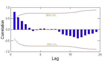
Figure 5-2. Correlogram example.
Variograms. Variograms (also known as a semi variogramA plot of the variance (one-half the mean squared difference) of paired sample measurements as a function of the distance (and optionally the direction) between samples. Typically, all possible sample pairs are examined, distance and directions. Variograms provide a means of quantifying the commonly observed relationship that samples close together will tend to have more similar values than samples far apart (EPA 1989). A graphical tool used in geostatistical analysis.) plot a variogram coefficient associated with a selected model of temporal or spatial correlation versus data from different lags and angles in an effort to fit the selected model to the data. The selected model is subsequently used in krigingA weighted moving-average technique to interpolate the data distribution by calculating an area mean at nodes of a grid (Gilbert 1987). for contouring of the data. An example of a variogram is provided in Figure 5-3.
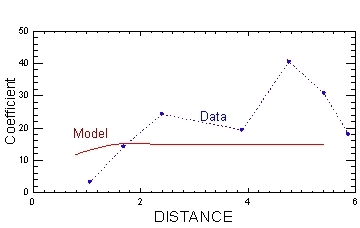
Figure 5-3. Variogram example.
Time series plots show the following:
- concentration trends over time
- lack of randomness
- changes in location (for example, of a plume or of the highest concentrations)
- degradation (when concentration vs. time plots are viewed for a contaminant and its degradation by-products)
Figure 5-4 illustrates a time series plotA graphic of data collected at regular time intervals, where measured values are indicated on one axis and time indicated on the other. This method is a typical exploratory data analysis technique to evaluate temporal, directional, or stationarity aspects of data (Unified Guidance). with data from two monitoring wells over seven years.
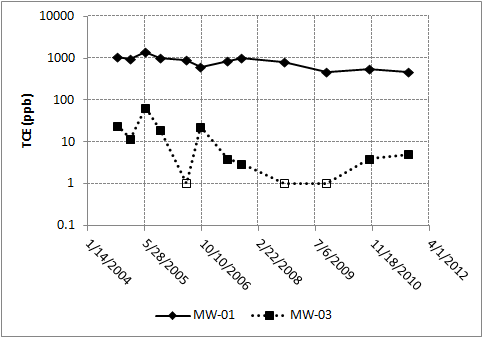
Figure 5-4. Time series plot example.
- Study Question 1: What are the backgroundNatural or baseline groundwater quality at a site that can be characterized by upgradient, historical, or sometimes cross-gradient water quality (Unified Guidance). concentrations?
- Study Question 5: Is there a trend in contaminant concentrations?
- Study Question 6: Is there seasonality in the concentrations?
- Study Question 7: What are the contaminant attenuation rates in wells?
- Study Question 8: How do contaminant concentrations change with distance from the source area?
- Time series methods may also be used to investigate stationarityStationarity exists when the population being sampled has a constant mean and variance across time and space (Unified Guidance)., which is an underlying assumption for many statistical methods.
Data come from a consistent set of representative wells over a series of sampling events.
- Assign a value to nondetectsLaboratory analytical result known only to be below the method detection limit (MDL), or reporting limit (RL); see "censored data" (Unified Guidance)..
- Use different symbols to depict nondetects versus measured data values on the plot.
- Be sure that data are collected with sufficient frequency and at a sufficient number of points to answer the questions of interest. For instance, annual monitoring would be insufficient to evaluate seasonal variation, but may be sufficient to identify directional trends. A minimum of two measurements are needed, but a greater number of measurements increases the degree of confidence in detecting patterns. Also consider whether the series of monitoring events is sufficient to be representative of site conditions. For example, a series of four monitoring events conducted one month apart, or four annual monitoring events, may not be representative if the plume is affected by seasonal effects.
- Consider the scale of each axis of plots (cover the full rangeThe difference between the largest value and smallest value in a dataset (NIST/SEMATECH 2012). of data; highlight fluctuations by shrinking or spreading an axis as needed; consider use of a log scale).
- When comparing time series, use comparable scales. Standardizing or normalizing each variable might be necessary for plotting multiple chemicals on similar scales for subsequent comparison. Use of a log scale is recommended when data cover a large range of values (for instance, when graphing concentrations near a source area and at distal portions of a plume).
- If the wells selected for long term monitoring are not representative of the plume, the point of exposure, or other site characteristic, then statistical representations of data will also not be representative of the site conditions.
- These plots are quick and easy to construct using ordinary spreadsheet programs like Excel.
- These plots are not quantitative. They are typically used in conjunction with other quantitative information.
- These plots are useful for quickly and easily assessing patterns in data over time.
A description of how to construct a time series plot is found in Chapter 9.1, Unified Guidance. Chapter 14.2.1 provides an example of how to construct a time series plot for multiple series (parallel time series plot).
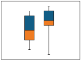
5.1.2 Box Plots
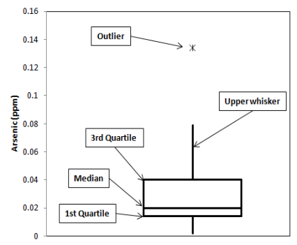
Box plots divide data into four groupings, each of which contain 25% of the data. The box most typically depicts the 25th (bottom of the box), 50th (horizontal line within the box) and 75th (top of box) percentile values while the whiskers can be selected to represent various extremes such as 1.5 times the interquartile rangeThe middle range of an ordered set of sample values between the 25th and 75th sample percentiles (Unified Guidance). (Tukey 1977), or 0% and 100% values. Points falling outside of the range depicted by the whiskers are plotted as individual points; you can evaluate these points as potential outliers. The meanThe arithmetic average of a sample set that estimates the middle of a statistical distribution (Unified Guidance). and the 95% upper confidence limit (UCL)The upper value on a range of values around the statistic (for example, mean) where the population statistic (for example, mean) is expected to be located with a given level of certainty, such as 95% (science-dictionary.org 2013). and lower confidence limit (LCL)The lower value on a range of values around the statistic (for example, mean) where the population statistic (for example, mean) is expected to be located with a given level of certainty (science-dictionary.org 2013). are often depicted on a box plotGraphic of selected descriptive statistics at a monitoring point such as mean, median, or upper and lower quartiles (Unified Guidance). as well.
The extent of the box is the interquartile range, which is the range of values between the 25th and 75th percentiles. A common convention is for whiskers to extend to 1.5 times the interquartile range on either side of the box. In this case, values between 1.5 and 3 times the interquartile range outside the whiskers are typically considered “mild” outliersValues unusually discrepant from the rest of a series of observations (Unified Guidance). while values greater or less than 3 times the interquartile range are considered “extreme” outliers. Graphing two data sets on side-by-side box plots provides an easy method of data comparison.
Figure 5-5 illustrates a box plot.
- Two subsets may be compared to evaluate spatial variabilitySpatial variability exists when the distribution or pattern of concentration measurements changes from well location to well location (most typically in the form of differing mean concentrations). Such variation may be natural or synthetic, depending on whether it is caused by natural or artificial factors (Unified Guidance)..
- Background data from different sources can be evaluated on side-by-side box plots to confirm that they represent a single data set.
- A comparison of a box plot representing background data to a box plot of data from individual wells may be used to evaluate whether concentrations from a particular well are above background concentrations.
- Box plots are useful for initial identification of potential outliers.
- Box plots are also useful for investigating and visualizing the mean value (centerline of the box), the variation or spread of the data (interquartile range or height of the box), the symmetry (sizes of box halves and whiskers), and the skewnessA measure of asymmetry of a dataset (Unified Guidance). of the data (the relative size of the box halves).
- Study Question 1: What are the background concentrations?
- Study Question 2: Are concentrations greater than background concentrations?
- Assign a value to nondetects.
- This method is most useful with data sets containing eight or more values.
- Box plots are a quick, convenient way to view the distribution of a data set.
- These plots can be used for any type of data distribution.
- Box plots are a simple graphical method; results can be readily interpreted.
- This method is useful for comparing data sets side by side.
- The use of box plots for purposes such as identification of outliers is not quantitative.
- Generally, software is required to display box plots, although it is possible to construct them in spreadsheet programs with some effort.
- Box plots illustrate the characteristics of data for only a single variable.
- Depending upon the software used to construct the plot, a box plot may not show all individual data points.
- Identification of outliers depends on the extent of the tail, is fairly arbitrary, and not conclusive.
Refer to Chapter 9.5 and Chapter 12.2, Unified Guidance. An example of an application of box plots may be found in Chapter 9.2, Unified Guidance.
5.1.3 Scatter Plots
Scatter plots display the relationship between two or three variables when comparing data sets consisting of multiple observations per sampling pointA specific spatial location from which groundwater is being sampled.. Linear relationships will manifest in points clustering about a straight line. Figure 5-6 illustrates a scatter plot.
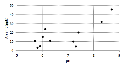
Figure 5-6. Scatter plot example.
- Evaluate the relationship of two or three variables to one another.
- Identify potential outliers.
- Identify clustering of data.
- Determine if the concentrations of contaminants are related in a definable way.
- Study Question 5: Is there a trend in contaminant concentrations?
- Study Question 6: Is there seasonality in the concentrations?
- The data range is sufficiently large to be representative of the data set.
- X and Y values are not affected by outside factors. See Section 5.1.1: Time Series Methods .
- Data sets should consist of multiple observations per sampling point and a sufficiently large data range.
- Assign values to nondetects.
- Assign different symbols to nondetect values.
- It is possible for variables with non-linear relationships to appear linear if the data range is small.
- Scatter plots are a simple graphical method and results can be readily interpreted.
- This method is useful for comparing data sets side by side.
- The use of scatter plotsGraphical representation of multiple observations from a single point used to illustrate the relationship between two or more variables. An example would be concentrations of one chemical on the x-axis and a second chemical on the y-axis. They are a typical exploratory data analysis tool to identify linear versus nonlinear relationships between variables (Unified Guidance). for purposes such as identification of outliers or evaluation of trends is not quantitative.
- No special software is needed to create two dimensional plots; some software can plot three axes.
- Scatter plots only show relationships between two (or three) variables on a given plot.
- X and Y values may appear to have no clear relationship when influenced by an outside factor that was not taken into consideration.
See Chapter 9.4, Unified Guidance for further information and a sample problem using scatter plots.
5.1.4 Histograms
Histograms present data in terms of bars of height (Y) in relation to a parameter (X), permitting a comparison of the shape and size of the plot, and of the placement of the plot along the x-axis.
Figures 5-7 illustrates a bimodal distributionA data distribution that has two peaks or two modes (science-dictionary.org 2013; NIST/SEMATECH 2012). of data in a histogram.
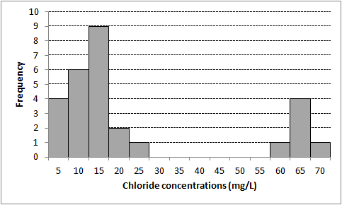
Figure 5-7. Histogram example (bimodal distribution).
Figure 5-8 illustrates a non-normal and skewed distribution of data in a histogram.
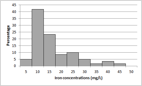
Figure 5-8. Histogram example (non-normal and skewed distribution).
- Histograms can be used to identify whether data are representative of a single population (one peak) or whether data may be representative of two separate populations (such as background data and data representing site contamination).
- This method is useful in EDAexploratory data analysis to evaluate the underlying data distribution.
- Study Question 1: What are the background concentrations?
- Study Question 2: Are concentrations greater than background concentrations?
- This method is best applied to data representing a snapshot in time (as opposed to continuous measurements).
- Modifying the bin size can affect the shape of the plot.
- When comparing histogramsGraphical representation of frequency with data values grouped into specified numerical ranges (Unified Guidance). for multiple data sets, consider placing the histograms one above another rather than side by side.
- Construction of histograms does not require highly specialized software and is relatively quick and simple.
- Histograms provide a quick and easy method to investigate the skewness and symmetry of data.
- The accuracy of the visual data representation provided by histograms depends on the bin size selected for the plot (x-axis).
- This method does not provide a good representation of the center of the distribution.
-
Y-axis data can be plotted as counts (for example, number detections) or as a percentage (for example, percent of detections).
See Chapter 9.3, Unified Guidance for further information and an example problem.
5.1.5 Probability Plots
Probability plots help to evaluate how well data fit a theoretical distribution, such as a normal distributionSymmetric distribution of data (bell-shaped curve), the most common distribution assumption in statistical analysis (Unified Guidance)., or gammaA gamma distribution or data set. A parametric unimodal distribution model commonly applied to groundwater data where the data set is left skewed and tied to zero. Very similar to Weibull and lognormal distributions; differences are in their tail behavior, and the gamma density has the second longest tail where its coefficient of variation is less than 1 (Unified Guidance; Gilbert 1987; Silva and Lisboa 2007). distribution. Probability plots express the theoretical distribution as a straight line and departures from the distribution appear as departures from the straight line. Data skewness or asymmetry, presence of outliers, and heavy tails of the data distribution (non-normal distribution) are obvious on probability plotsGraphical presentation of quantiles or z-scores plotted on the y-axis and, for example, concentration measurement in increasing magnitude plotted on the x-axis. A typical exploratory data analysis tool to identify departures from normality, outliers and skewness (Unified Guidance).. If the data do not fit the selected distribution, data can be transformed using a lognormalA dataset that is not normally distributed (symmetric bell-shaped curve) but that can be transformed using a natural logarithm so that the data set can be evaluated using a normal-theory test (Unified Guidance). or other transformation in order to determine whether data fits an alternative distribution. A quantile-quantile plotA graph of the ranked data versus the fraction of data points it exceeds (USEPA 2006c). may be used to compare two empirical distributions.
To generate probability plots, order the data, and calculate matching percentiles from the normal distribution. Plot the ordered data against the percentiles and examine the plot for a straight-line fit. The straightness of the plot indicates how closely the data fit a normal distribution. If all of the raw data closely follow a straight line, the suspected outliers are probably part of the same distribution and should not be considered outliers. Points that appear off of a linear pattern in the rest of the data may be outliers; however, be aware that other reasons, such as non-normal data, can also explain nonlinearity.
Figure 5-9 illustrates a data set as a probability plot. Figure 5-10 presents the same data in a histogram. Figure 5-11 presents the logarithms of the same data as a probability plot and Figure 5-12 presents the histogram of the log transformed data.
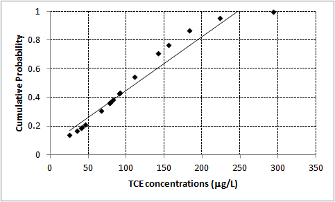
Figure 5-9. Data set as a probability plot.
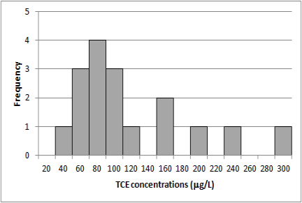
Figure 5-10. Data set as a histogram.
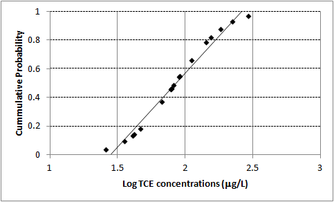
Figure 5-11. Logarithms of data set as a probability plot.
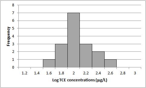
Figure 5-12. Histogram of log-transformed data.
- Probability plots can be used to identify whether data are representative of a single population or whether data may be representative of two separate populations (for example, background data and data representing site contamination).
- These plots can help to evaluate underlying data assumptions prior to application of other statistical tests.
- How well do data fit a theoretical distribution?
- What is the reason for departure of the data from the theoretical distribution?
- Study Question 1: What are the background concentrations?
- Study Question 2: Are concentrations greater than background concentrations?
Data follow a single distribution, typically the normal distribution; it is possible to use this test with data that can be normalized, such as lognormal data, or to evaluate other distributions, such as a gamma distribution.
- Although examination of the probability plot will help assess whether the data are normal or not, you should confirm normality using another test. Further tests for normality are correlation coefficients and Shapiro-Wilk tests.
- If there are nondetect data, simple substitution will result in nonlinearity, so use an appropriate method for dealing with censored dataValues that are reported as nondetect. Values known only to be below a threshold value such as the method detection limit or analytical reporting limit (Helsel 2005)., such as ROS, maximum likelihood estimation (MLE), or Kaplan-Meier.
- If the data do not appear to be linear, try normalizing the data by log-transforming the data and creating another probability plot.
- If the log-transformed data fits a straight line with no points off the line, the data are lognormal and there are probably no outliers.
- If neither of these plots fit a straight line and one or more data points appear to be off the line of the rest of the data, remove these points and re-plot the data.
- If removal of data results in a straight line then this is evidence that the removed data do not follow the same distribution as the rest of the data.
- While departures from the theoretical distribution are easy to identify, you must evaluate the significance of the departure.
- Probability plots are useful in comparing characteristics of groups of data, such as skewness.
- Lognormal data can be transformed and the test conducted on the transformed data. If the data still do not follow a straight line, test whether the removal of some points results in a straight line. Probability plots offer an excellent graphical method for identifying normal data and data points that lie outside the normal distribution. Using probability plots for identifying outliers is only applicable for distributions that have been verified.
A description of how to construct a probability plot is found in Chapter 8.3, Chapter 9.5, and Chapter 12.1, Unified Guidance.
Publication Date: December 2013